
Some places impress you the moment you walk in. This veterinary clinic is one of them.
Years of experience, continuous education and hands-on clinical practice have shaped a reputation built on trust and results.
Their website had to become the clinic’s digital business card, a place where pet owners could immediately sense they were in capable, informed hands, well before booking an appointment or walking through the door.
From the light-filled reception area to the glossy cabinetry, advanced equipment and carefully considered interiors, everything within the clinic signals quality. But beyond the space itself stands something even more valuable: exceptional veterinary expertise.
Exploring the possibilities
As with all our projects, we began by exploring multiple design directions together.
We discussed approaches that leaned more heavily into narrative-led layouts, rich in storytelling and visual rhythm, as well as sleeker, modern compositions focused on clarity and ease of use. Each direction was carefully mapped against the clinic’s reality, its clientele, its services and how the website would be used day to day.
Through these conversations, we aligned on a direction that felt most true to both the clinic and our client’s preferences: calm, confident and precise.
Our design approach
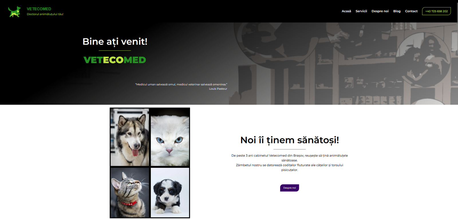
The design decision was to bring together a crisp, off-white background that creates breathing room and supports readability, while the clinic’s brand colours appear consistently across calls to action and key moments. Typography plays a central role, with the brand’s chosen font reinforcing clarity and professionalism throughout.
Services are presented in a carefully structured, categorised format — not only to support effortless navigation, but to reflect the breadth and organisation of the clinic’s medical offering. Each section is designed to inform without overwhelming, guiding visitors gently but confidently.
At the client’s request, extensive image galleries were integrated across the site, allowing visitors to explore the clinic’s spaces, facilities and atmosphere.
Functionality was just as important as aesthetics.
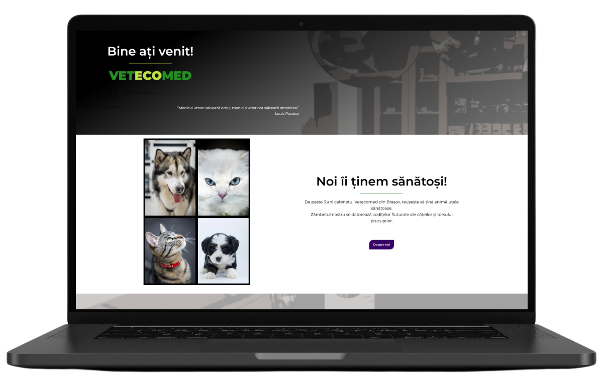
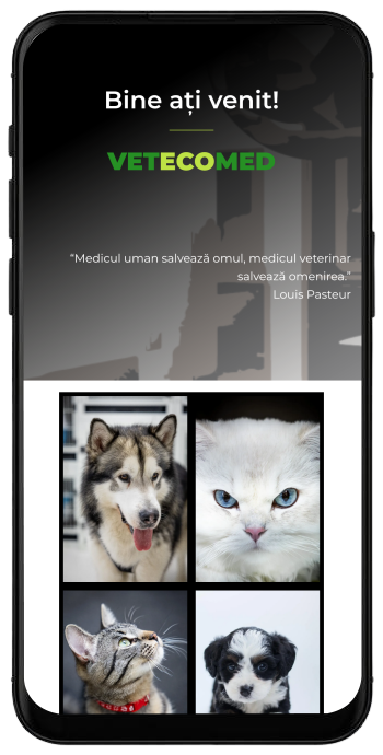
Every interaction was designed to work seamlessly — from calling the clinic and opening directions in Google Maps, to responsive site navigation on desktop, tablet and mobile.
The blog was intentionally designed as a long-term space for sharing veterinary knowledge, allowing the clinic to regularly publish articles, reinforce expertise and support pet owners over time.
The finished website mirrors the in-clinic experience: elegant, capable and reassuring. It is clean without feeling clinical, elegant without feeling cold and professional, clear and easy to navigate on any device.
Most importantly, it introduces a highly skilled veterinarian and her clinic with quiet confidence, aligning the digital experience seamlessly with the in-person one — and making the right impression before the first consultation ever takes place.
This project is a clear example of how our work adapts to context. Not every business needs the same visual language and not every story is told the same way.
Our role is to explore the possibilities, advise through experience and design what best serves the client, the audience and the business.
Let’s tell your story!
Let’s tell your story!