


The challenge
How do you translate decades of offline legal prestige into a digital experience that feels both authoritative and modern?
Griffin & Griffin fictional law firm had no prior website, leaving clients with no central way to explore services, meet attorneys, or understand their practice areas. The challenge was to create a digital identity that communicates trust, structure and professionalism while reflecting the firm’s heritage, but without feeling outdated.
The solution
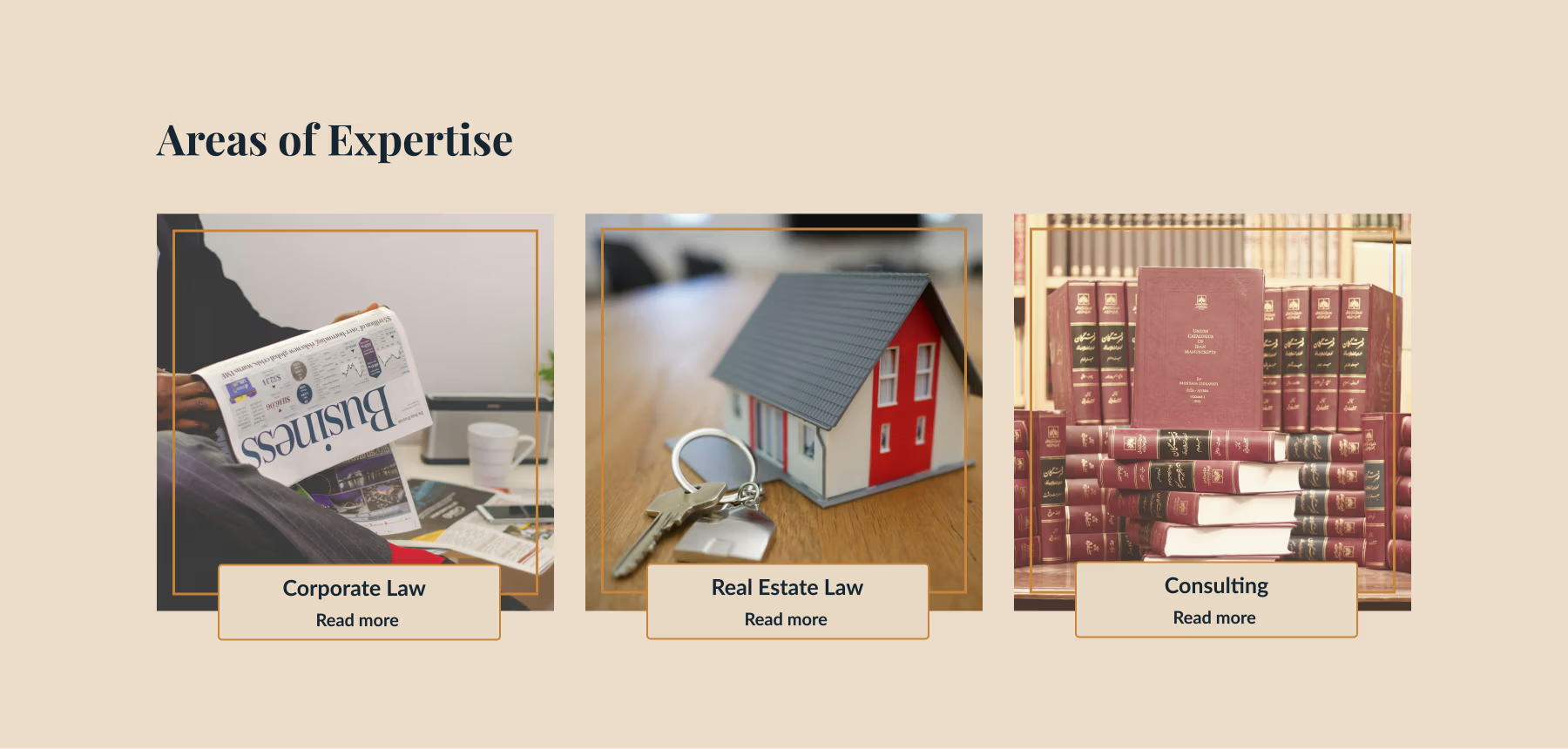
We designed a complete website concept blending traditional law firm structures with modern, subtle enhancements. Every section was designed to guide visitors naturally on a website that doesn’t just present information. It communicates credibility, refinement and trust at every scroll, giving clients a clear, engaging view of the firm’s values, people and expertise.
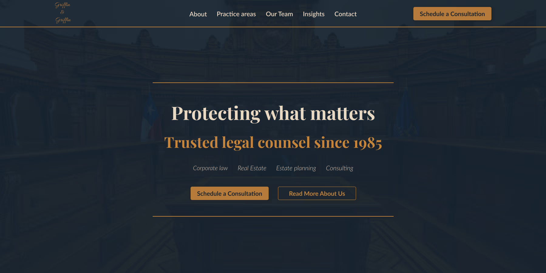
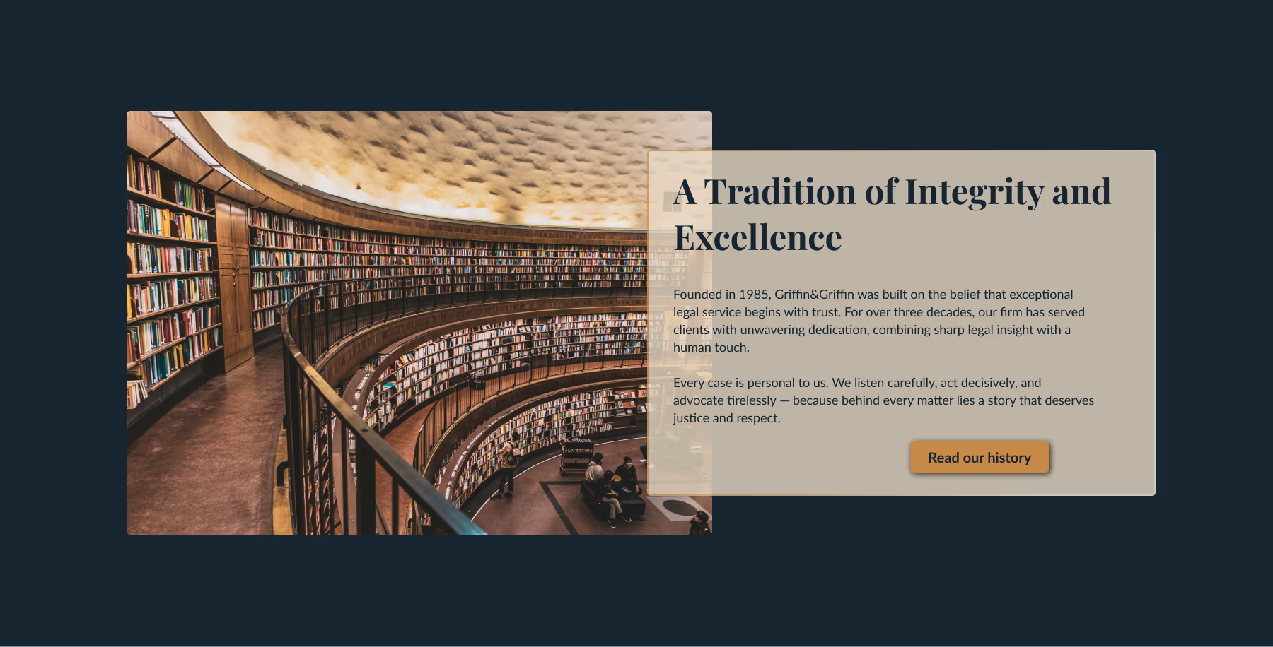
Every visual decision was made to reflect confidence, structure, and discretion – qualities central to the firm’s identity – while ensuring the experience feels current and approachable rather than rigid or dated. Rather than relying on overt visual statements, the design communicates trust through precision, restraint and consistency. Structured layouts, deliberate spacing and refined details create a sense of order and calm, allowing the firm’s expertise to speak for itself.
Deep navy tones provide visual weight and focus, while soft parchment backgrounds introduce lightness and readability. Copper accents are used sparingly, functioning as subtle signifiers of experience and refinement, never decorative, always intentional.
Midnight Ink
#172531
Deep Chestnut
#3E160C
Copper Accent
#C7843B
Soft Parchment
#E8D9C4
Typography plays a central role in shaping the site’s tone. The strong serif headings convey professionalism and authority, while the modern sans-serif body ensures readability and balances approachability.
Aa
Josefin sans – headings
Aa
Nunito – body text
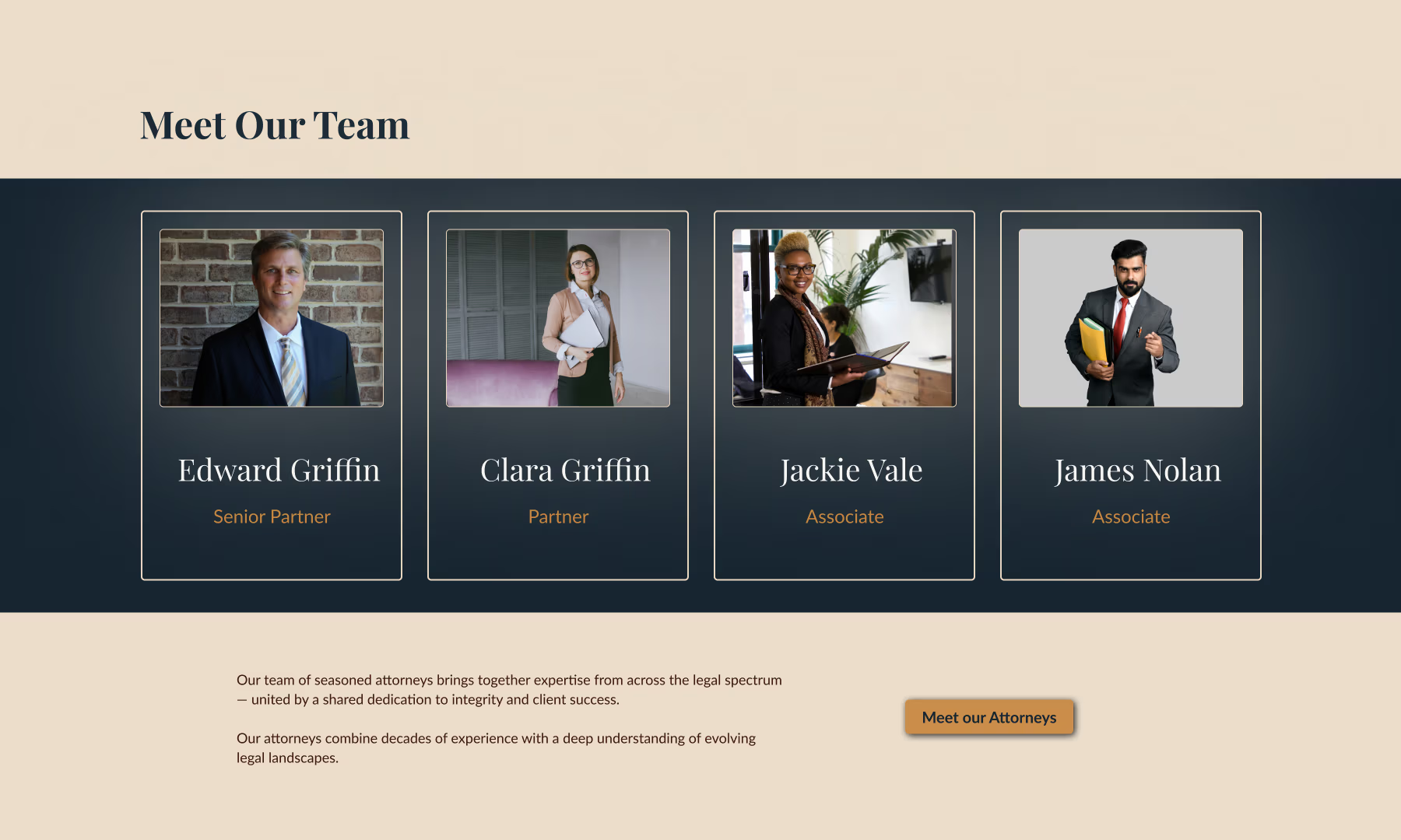
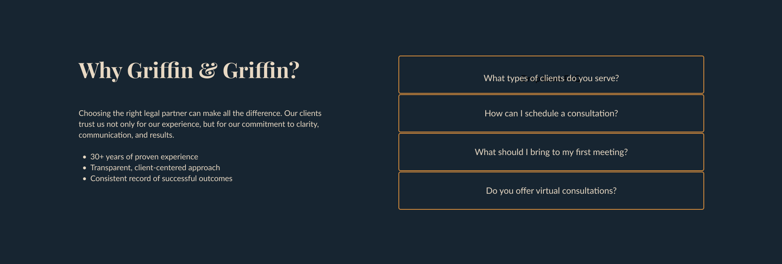
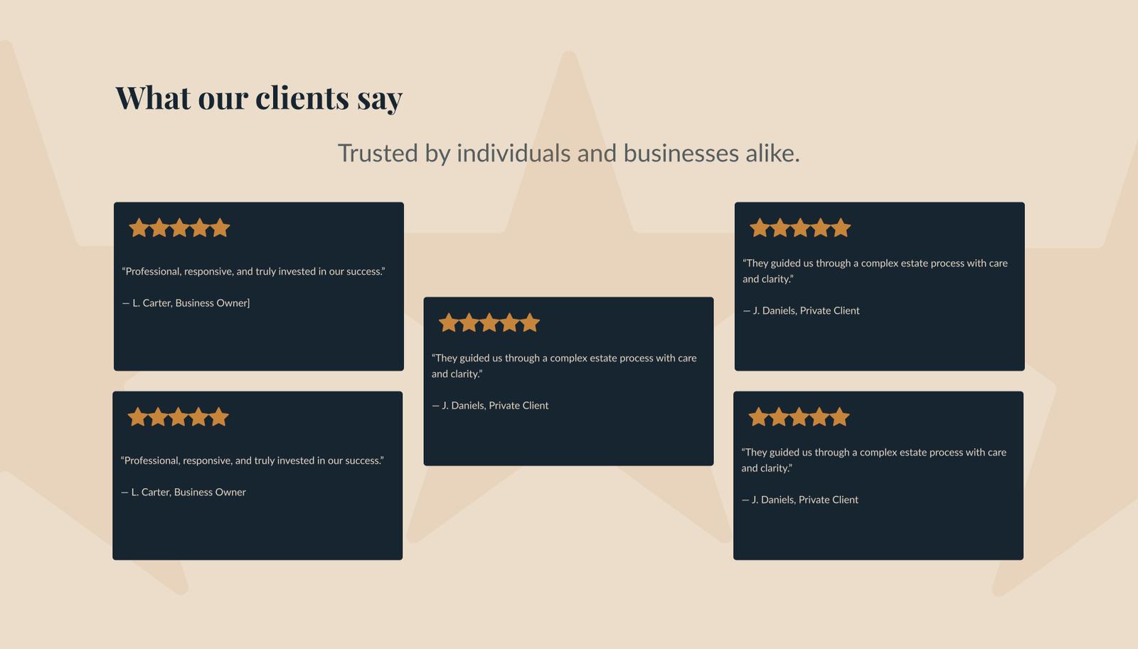
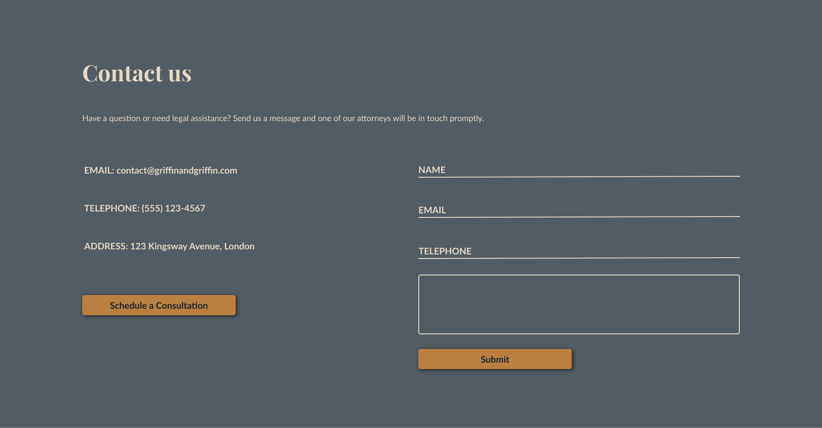
Visual storytelling is expressed through composition. Overlapping text and imagery introduce depth and movement, while lawyer profiles are presented with gallery-like framing, subtly referencing legacy, reputation and longevity. Deep navy tones evoke the precision of a “pressed suit in court”. The layout remains disciplined and predictable, creating a sense of stability that is essential for first-time visitors seeking reassurance.
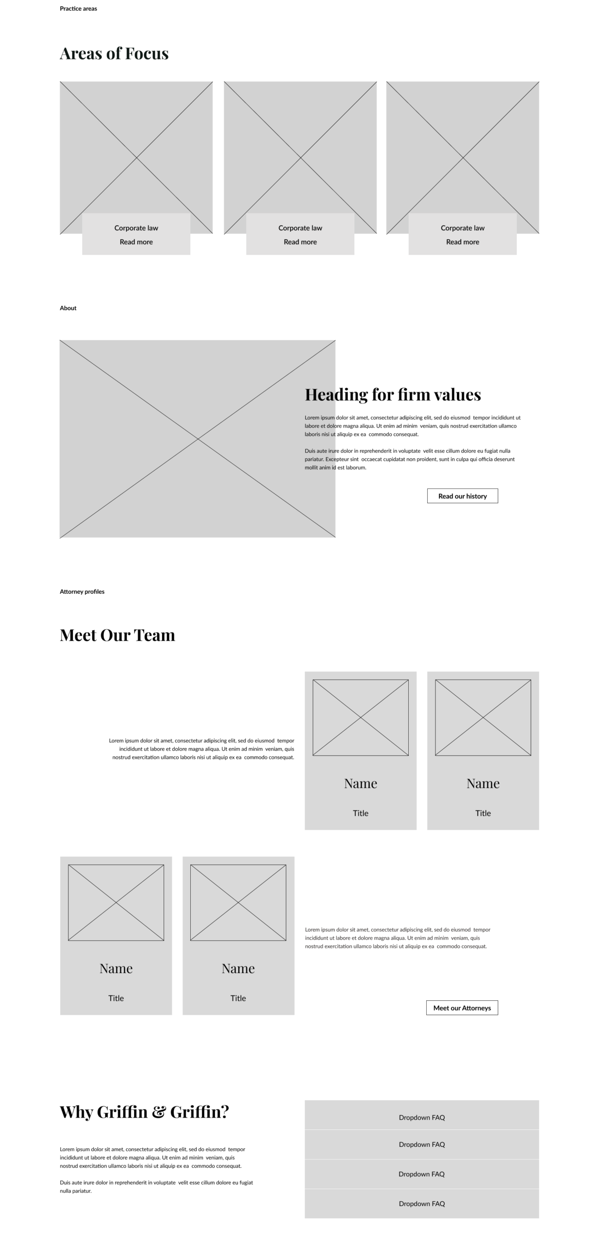
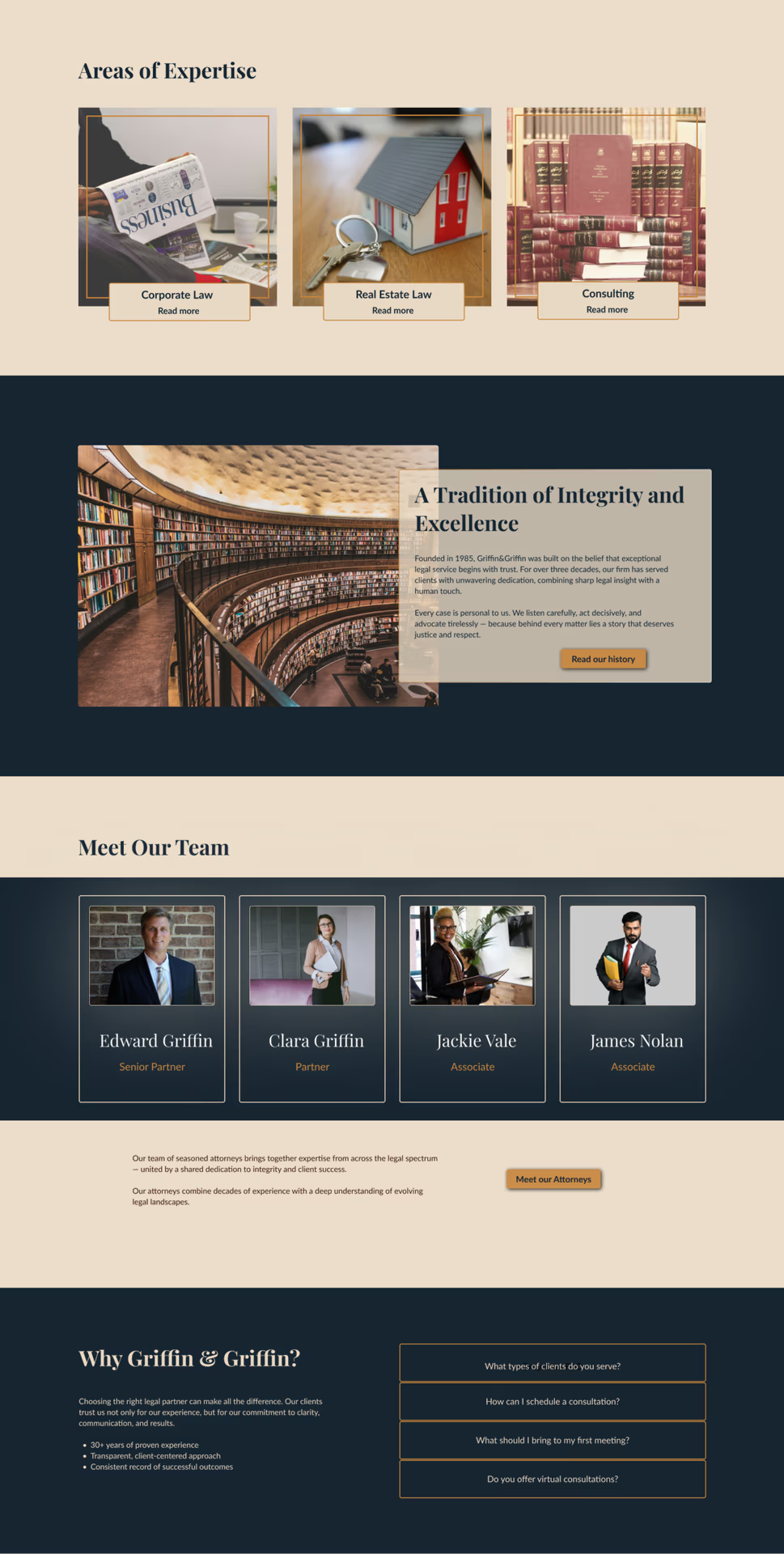
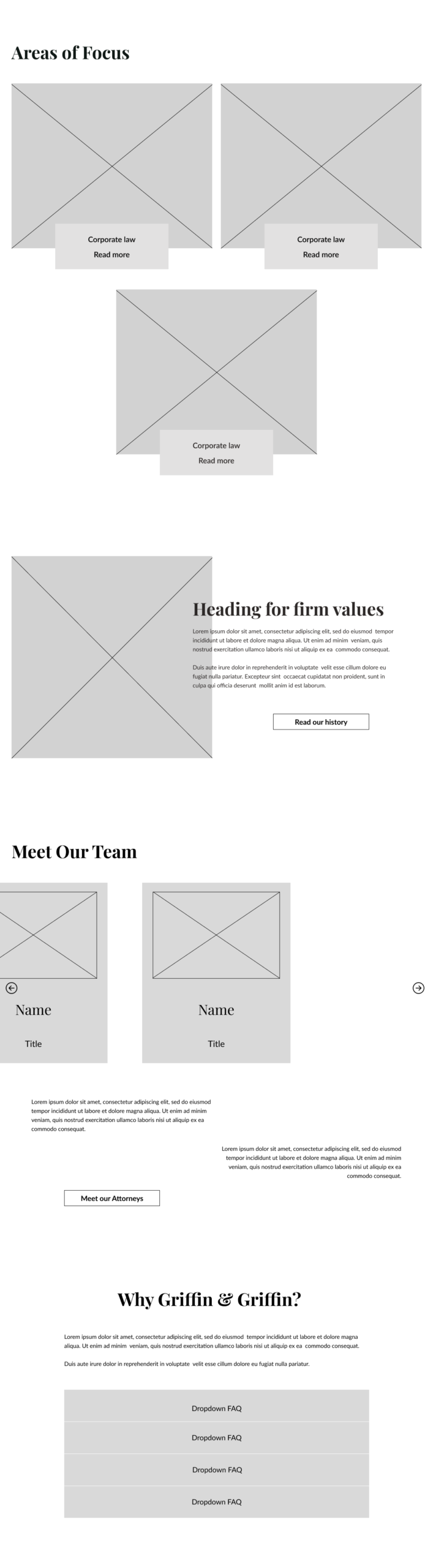
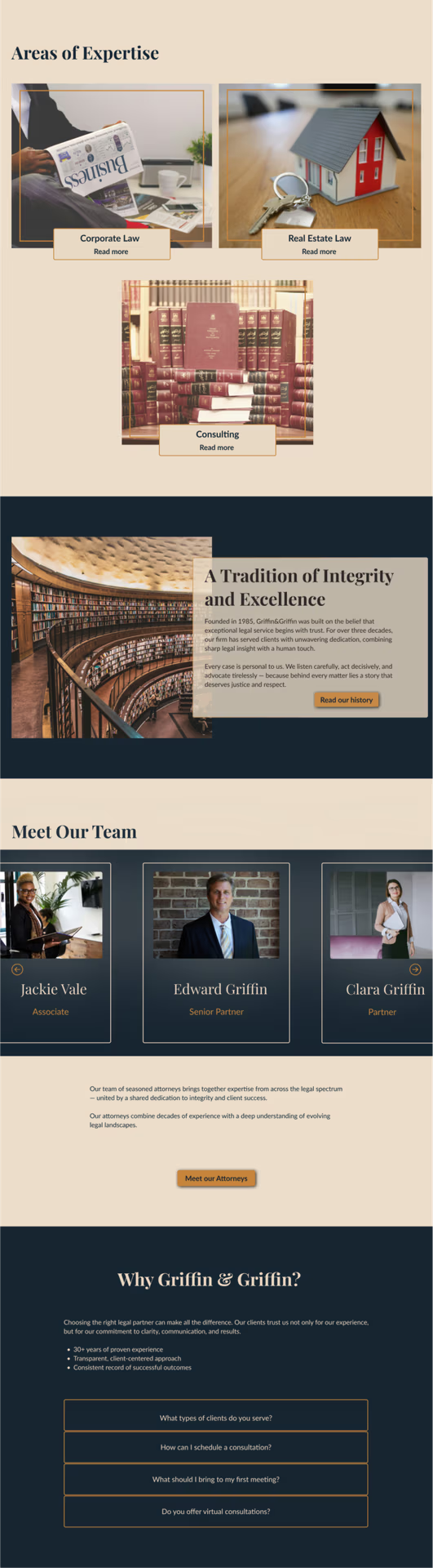
Side-by-side low- and high-fidelity wireframes illustrate how structured layouts evolve into a polished, dynamic design. Each section demonstrates hierarchy, readability and visual storytelling, translating complex content into a clean, approachable user experience.
Built on a solid structural foundation, the responsive design adapts seamlessly across desktop, tablet, and mobile. Users experience a cohesive, authoritative interface on every screen, with content flowing naturally and maintaining visual hierarchy and trust.
Let’s tell your story!
Let’s tell your story!
This project is a conceptual case study for a fictional business and is our original intellectual property, fully created in-house. This design is available for licensing or adaptation should you feel inspired by it.