
The challenge
How do you feel the warmth, texture, and subtle scent of new furniture…digitally?
Comfort Living relied on Facebook alone, limiting its ability to showcase products in a curated, premium format and communicate brand story. With no dedicated website, the brand risked appearing less established. The challenge was to translate the warmth and elegance of the furniture into a sleek, digital space that reflects their professional presence.
The solution
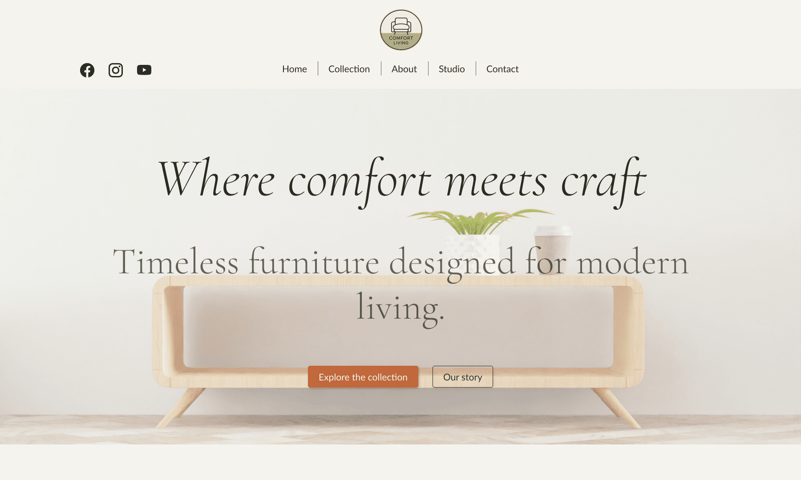
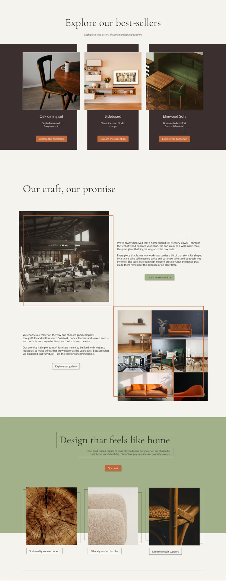
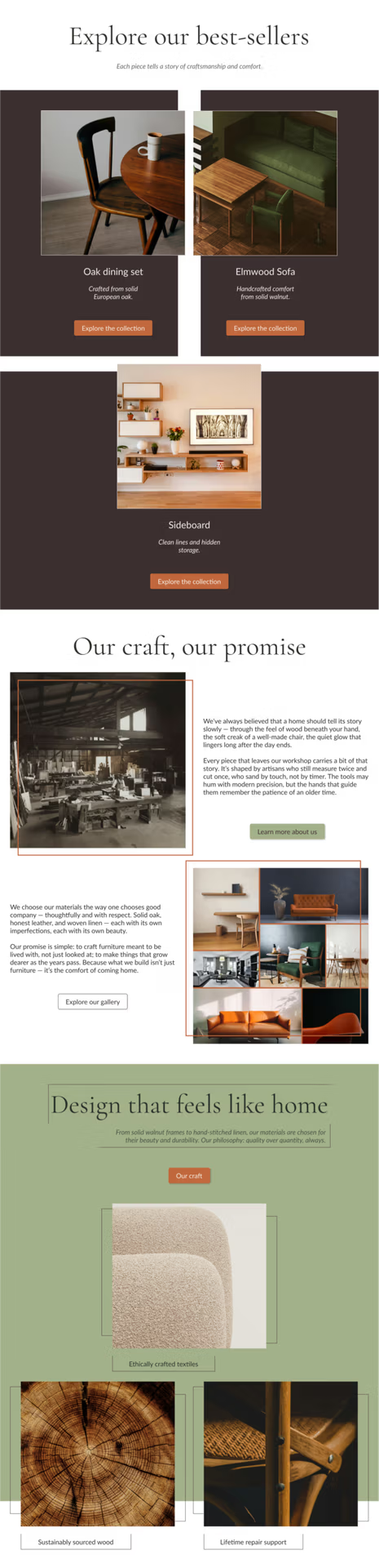
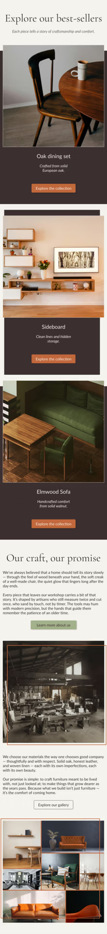
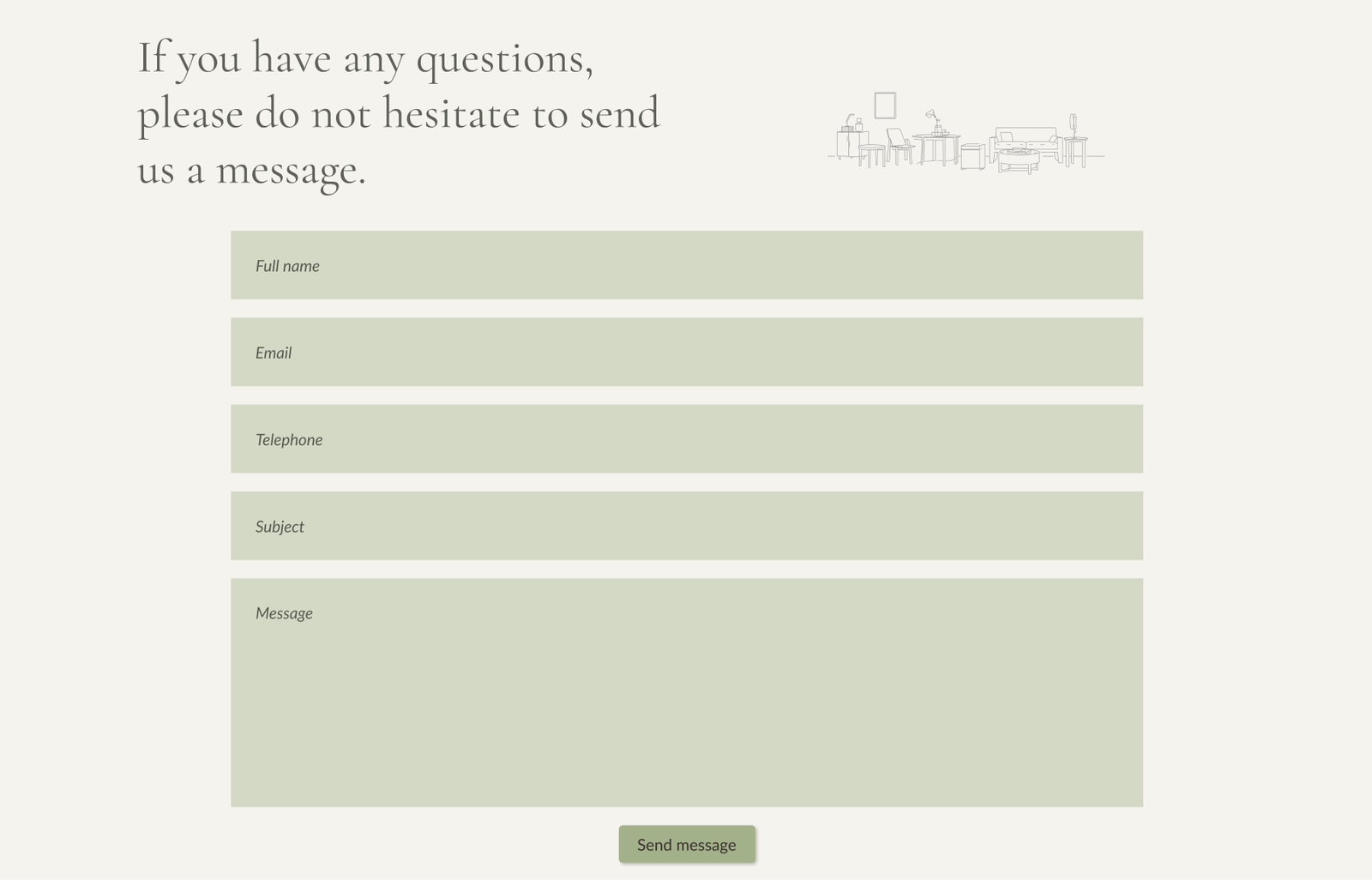
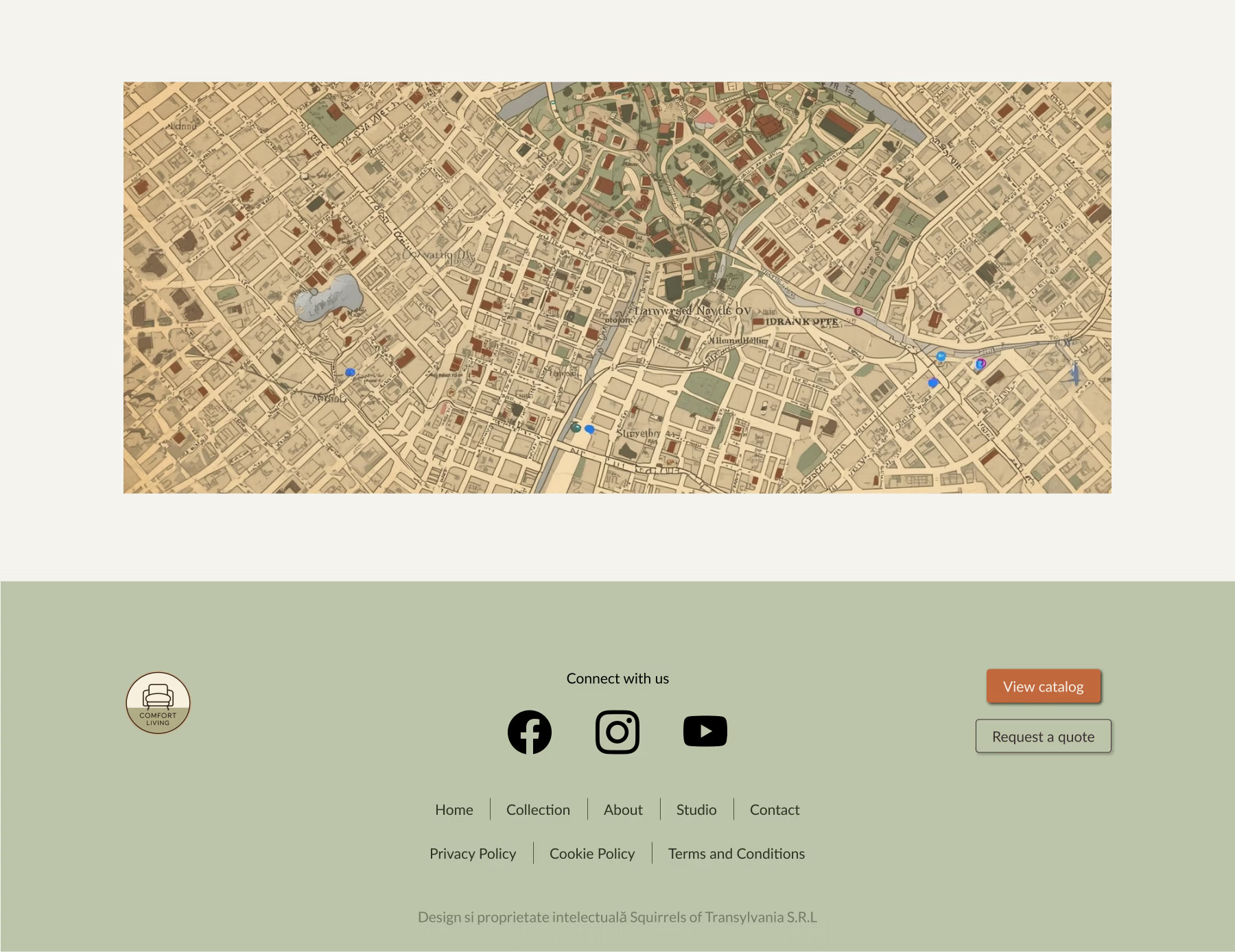
We designed a sleek, modern website that functions as a digital business card, a calm, curated environment where every piece of furniture can be appreciated visually and conceptually. Airy layouts, soft earthy pastels and generous white space highlight textures, materials and design details without distraction. We created an online environment that is minimalistic, sensory-rich, and professional yet inviting.
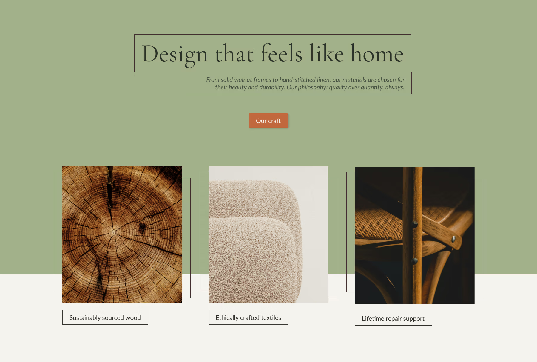
A warm, earthy palette and clean layouts bring Comfort Living’s tactile furniture online. Colours are inspired by natural materials and artisanal finishes, balancing modern elegance with approachable warmth.
We developed a warm, earthy palette inspired by natural materials and modern interior trends.
Charred Wood
#3B2F2F
Burnt Copper
#C1683C
Olive Grain
#A3B18A
Ivory Veil
#F5F3EE
Sculptural serif forms express artistry and heritage, while a clean sans-serif ensures readability and lets the materials and visuals shine. Headings, body text and accents work together to convey craftsmanship, clarity and modernity.
Aa
Cormorant Garamond – headings
Aa
Lato – body text
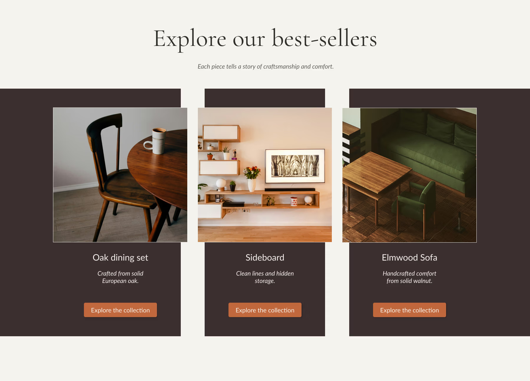
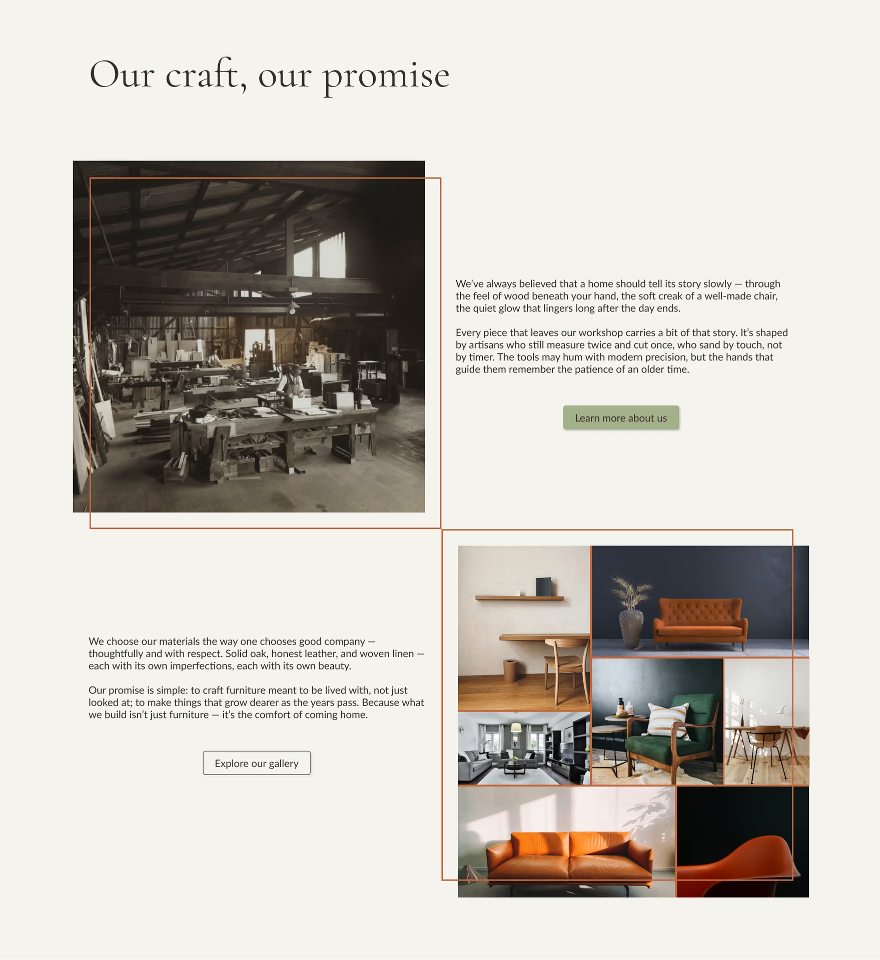
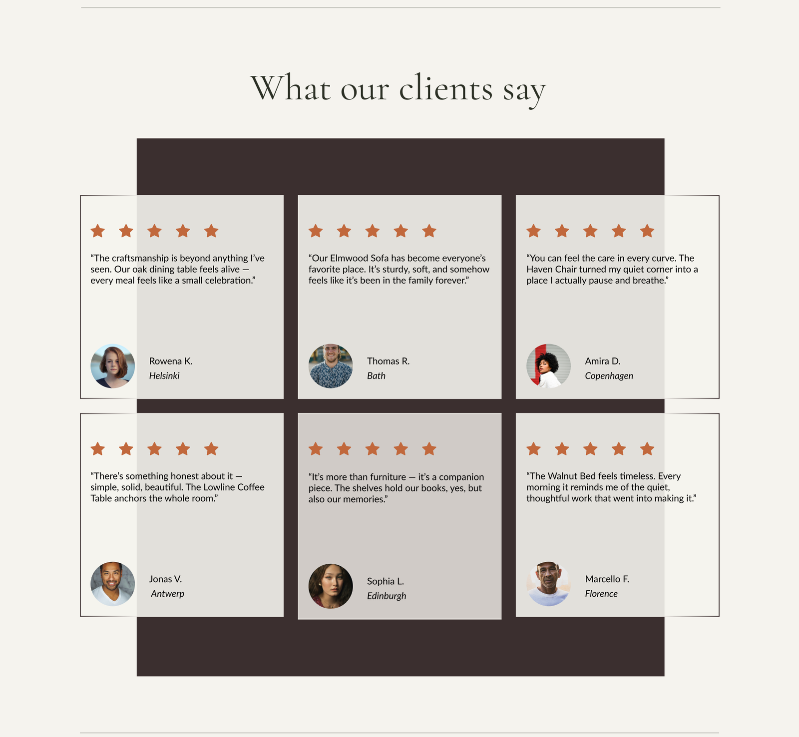
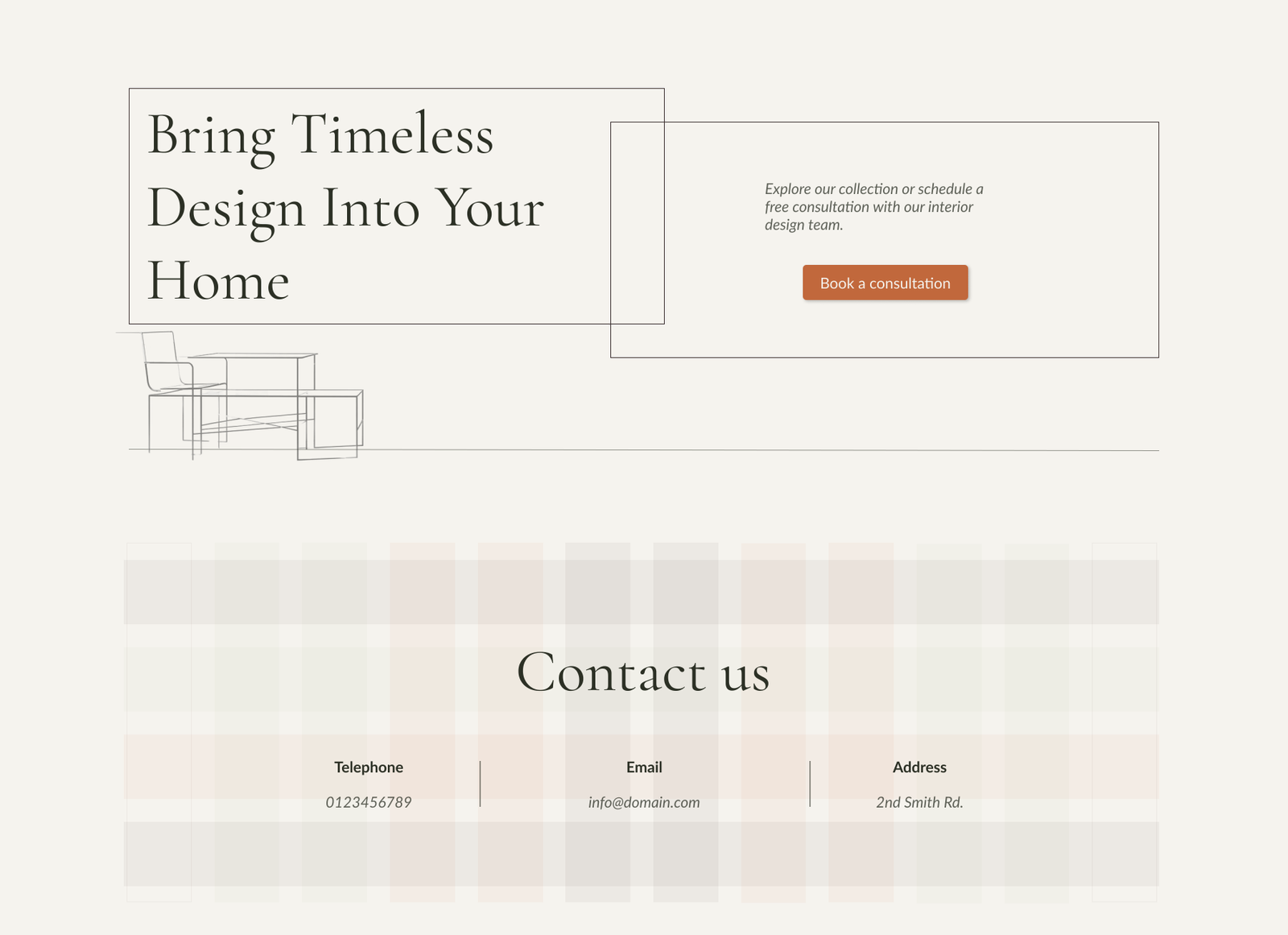
Floating layouts, offset outlines and content arrangements create dynamic movement while guiding the eye through the products collection. Site imagery showcases minimalistic furniture with visible material textures, while blocks of earthy colours evoke natural tones. Every visual choice emphasizes the feel, materiality and understated elegance of the brand, turning the website itself into a sensory exploration of Comfort Living’s products.
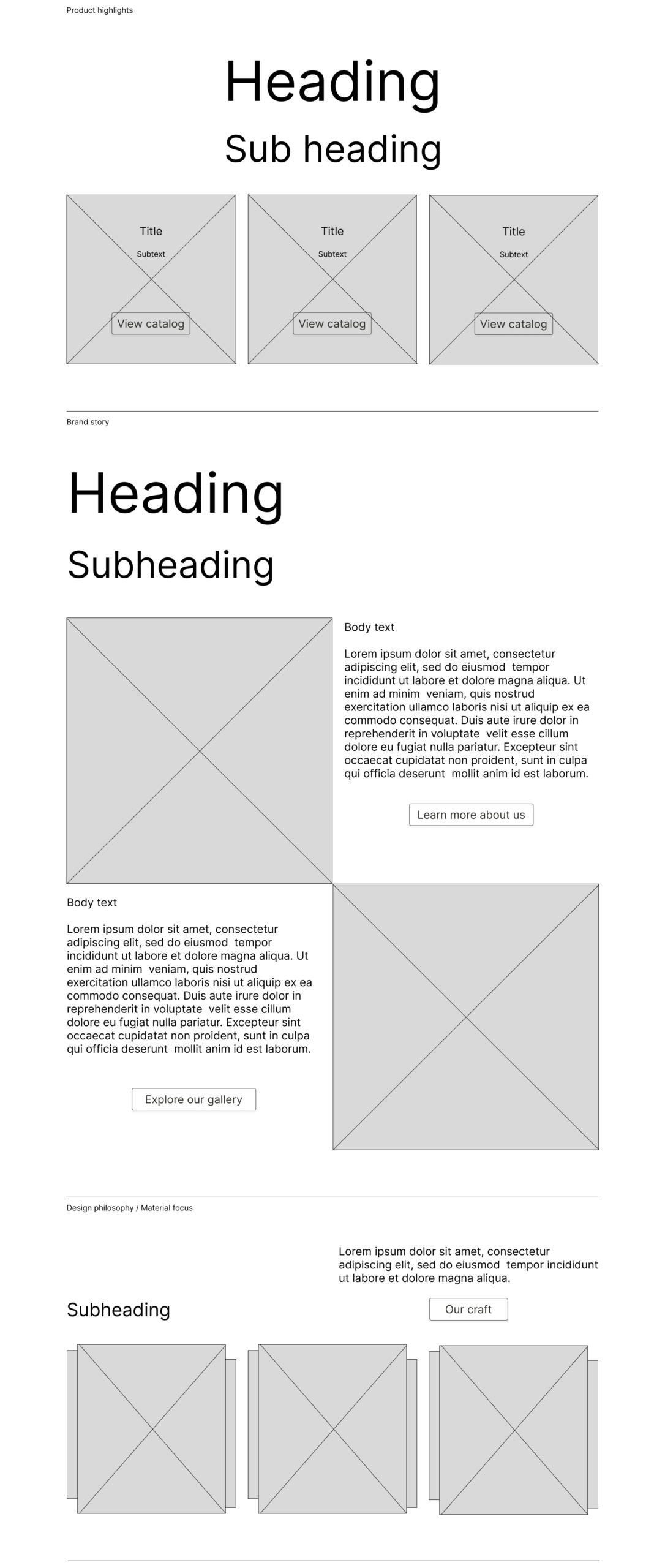
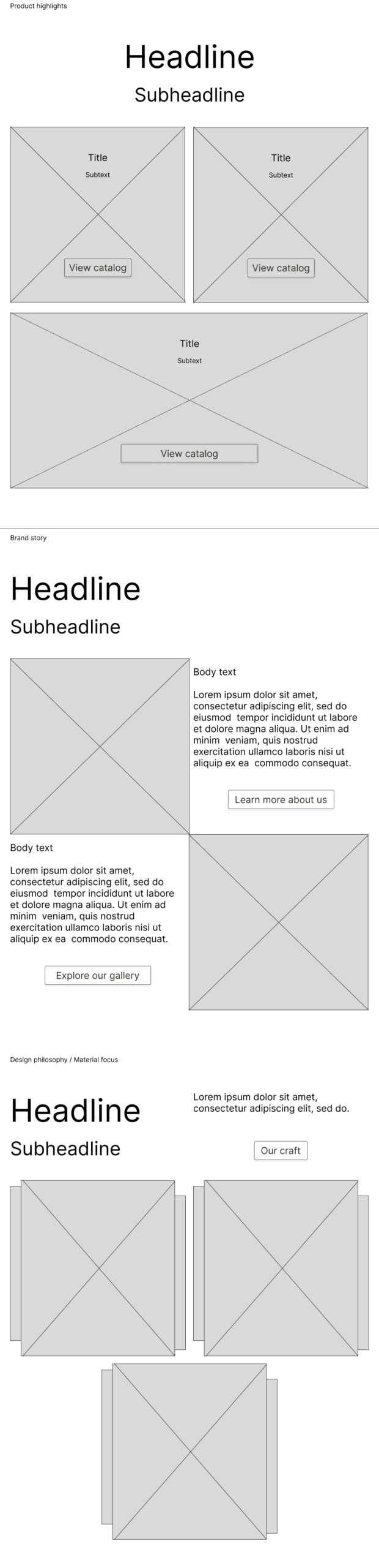
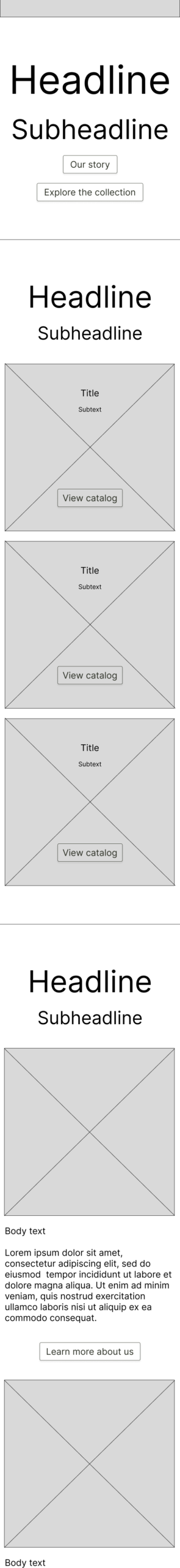
A comparison showing how the information architecture and UX decisions shape the low-fidelity wireframes, and how these foundations evolve into high-fidelity interfaces. Each section demonstrates how the same design principles translate across devices, preserving clarity, elegance and tactile emphasis at every screen size.
Built on a strong structural foundation, the responsive design adapts seamlessly across desktop, tablet, and mobile, ensuring every texture, material and layout nuance is preserved.
Let’s tell your story!
Let’s tell your story!
This project is a conceptual case study for a fictional business and is our original intellectual property, fully created in-house. This design is available for licensing or adaptation should you feel inspired by it.