The challenge
How do you make sound visible, palpable and deeply human…online?
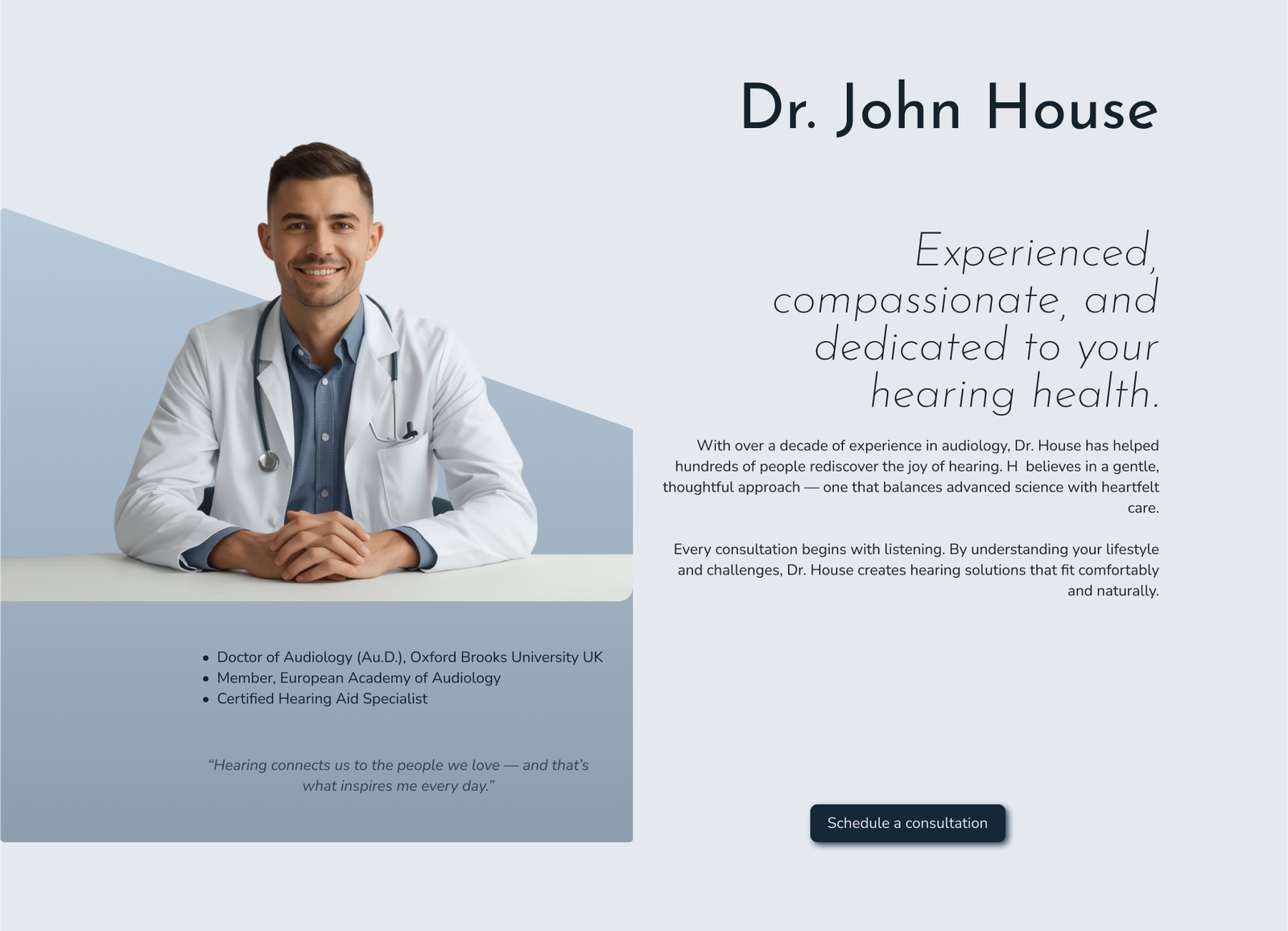
With no existing website, the clinic needed a digital presence that conveys clinical excellence, international credibility and compassionate care, all without feeling cold or abstract. The design had to balance technical sophistication with emotional comfort, evoking trust and clarity in a space where patients are often vulnerable.
The solution
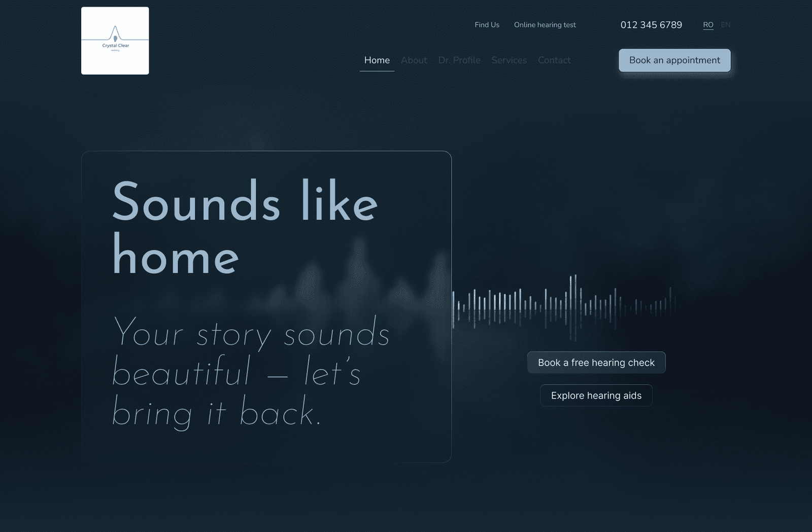
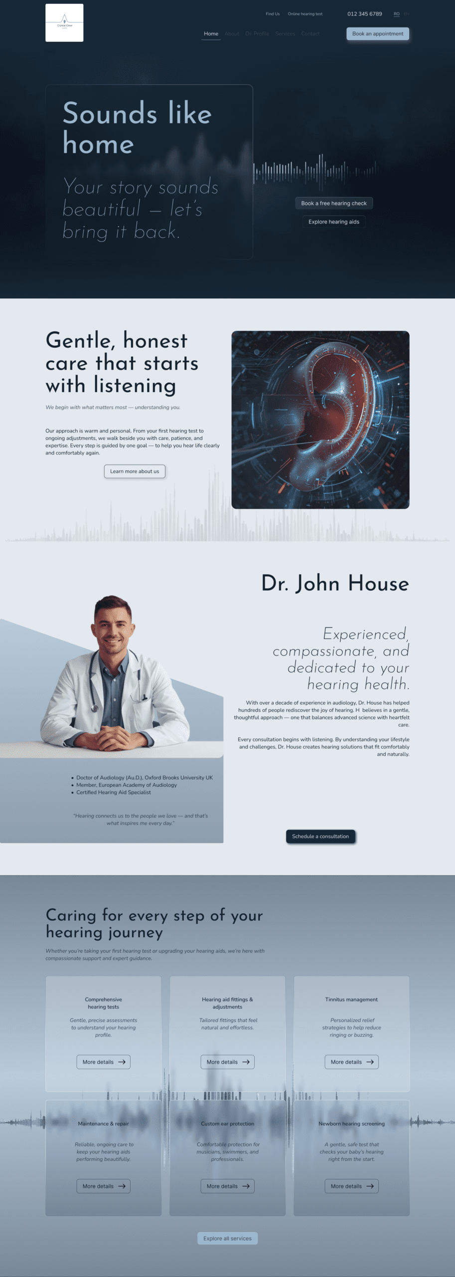
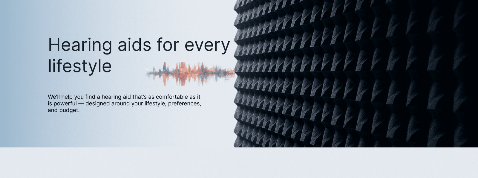
We created a layered, immersive website that treats sound as both data and sensation. Crisp whites and cool blues establish clarity, while dark soundwave backgrounds introduce depth and rhythm. Glossy and matte surfaces coexist, echoing the contrast between resonance and absorption in audiology spaces.
The design translates sound into a visible, tactile, and spatial experience. Wave-inspired patterns, layered transparency and carefully measured spacing combine to make the interface feel precise, calm and pacient-centered, reflecting the science, technology and the care behind audiology treatments.
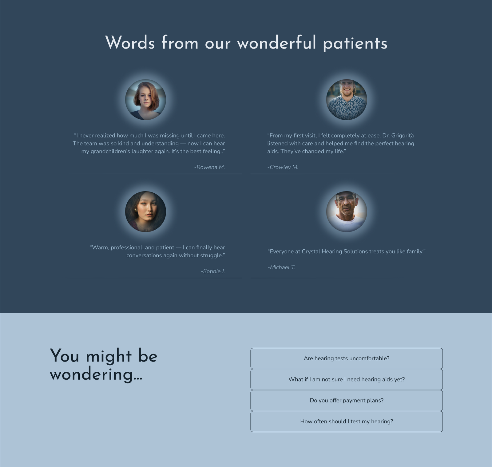
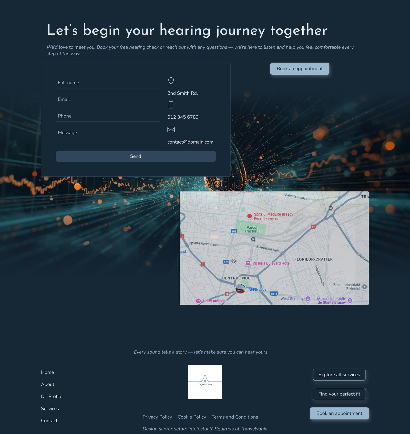
A refined palette of deep blues and airy neutrals guides clarity, trust and sensory comfort.
Deep Resonance
#162735
Acoustic Blue
#31465A
Airwave Mist
#9BB7CD
Soundproof White
#E4E9EF
The fonts we chose combine modern geometry, approachable readability and subtle elegance to communicate innovation, clarity and warmth. Together, the hierarchy and contrast balance technical sophistication with a patient-focused, welcoming tone.
Aa
Josefin sans – headings
Aa
Nunito – body text
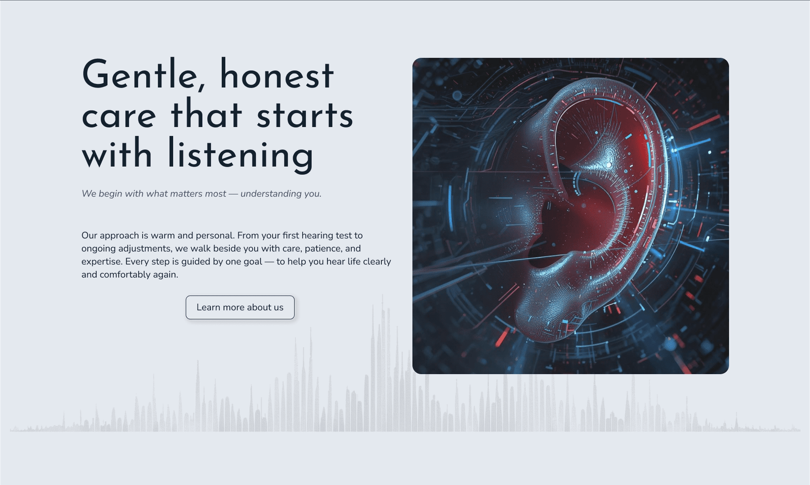
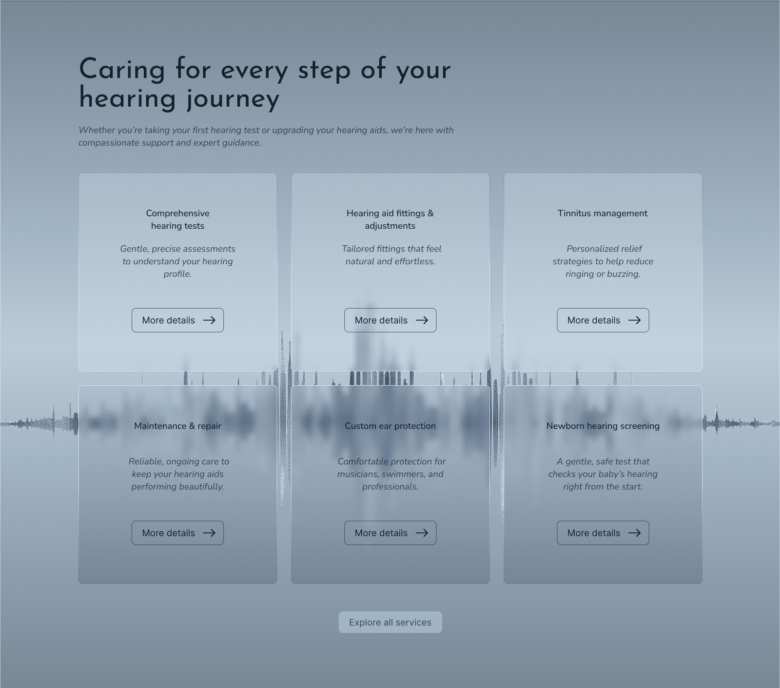
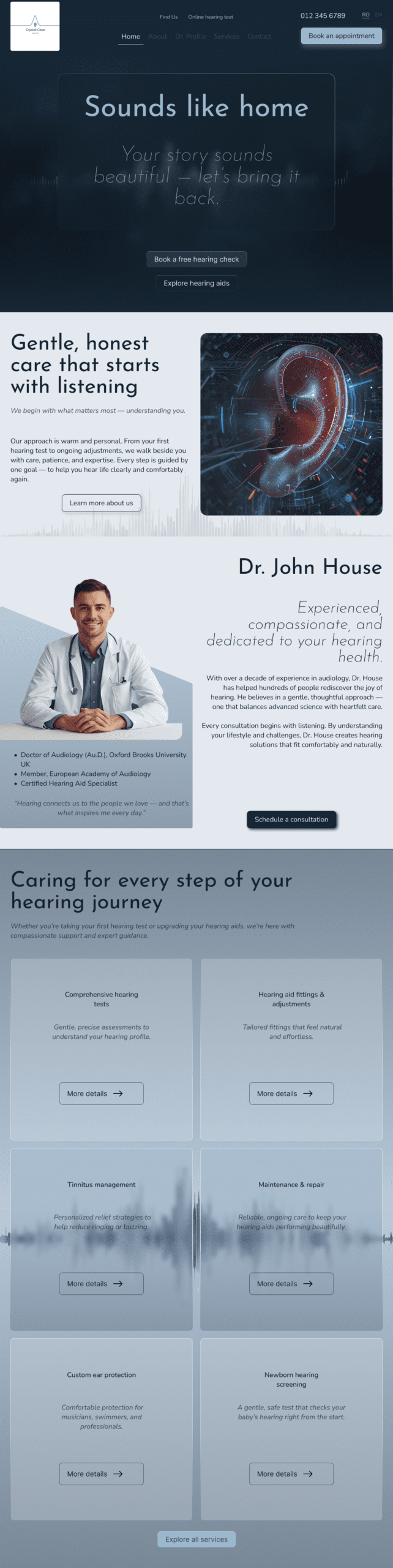
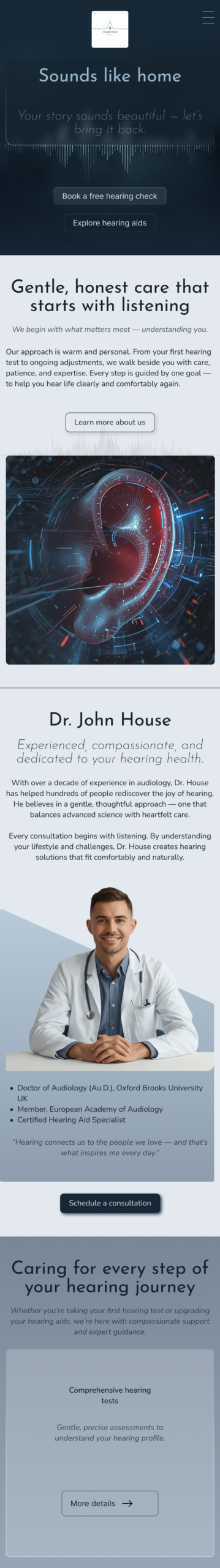
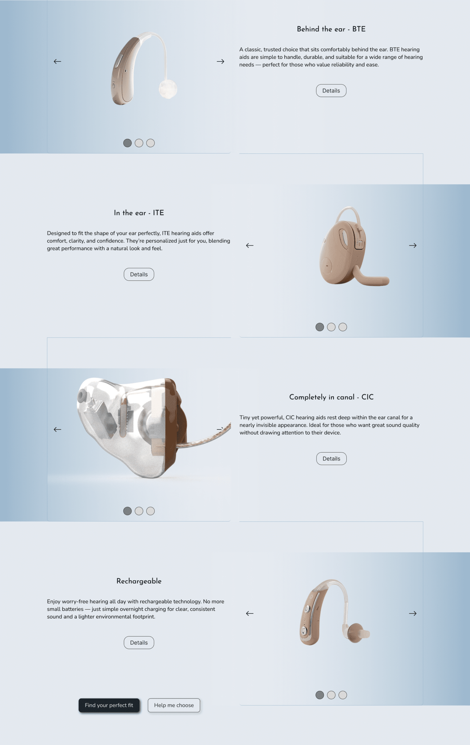
The interface brings sound to life through layered textures and visual cues. Grey acoustic foam backgrounds evoke the quiet, protective calm of audiology booths, while glossy, crystal-clear tile sections suggest clinical precision and modernity. Subtle wave-inspired patterns, layered transparency and rhythmic spacing guide the eye and mirror the rise and fall of sound, creating a digital space that feels both technically sophisticated and warmly human.
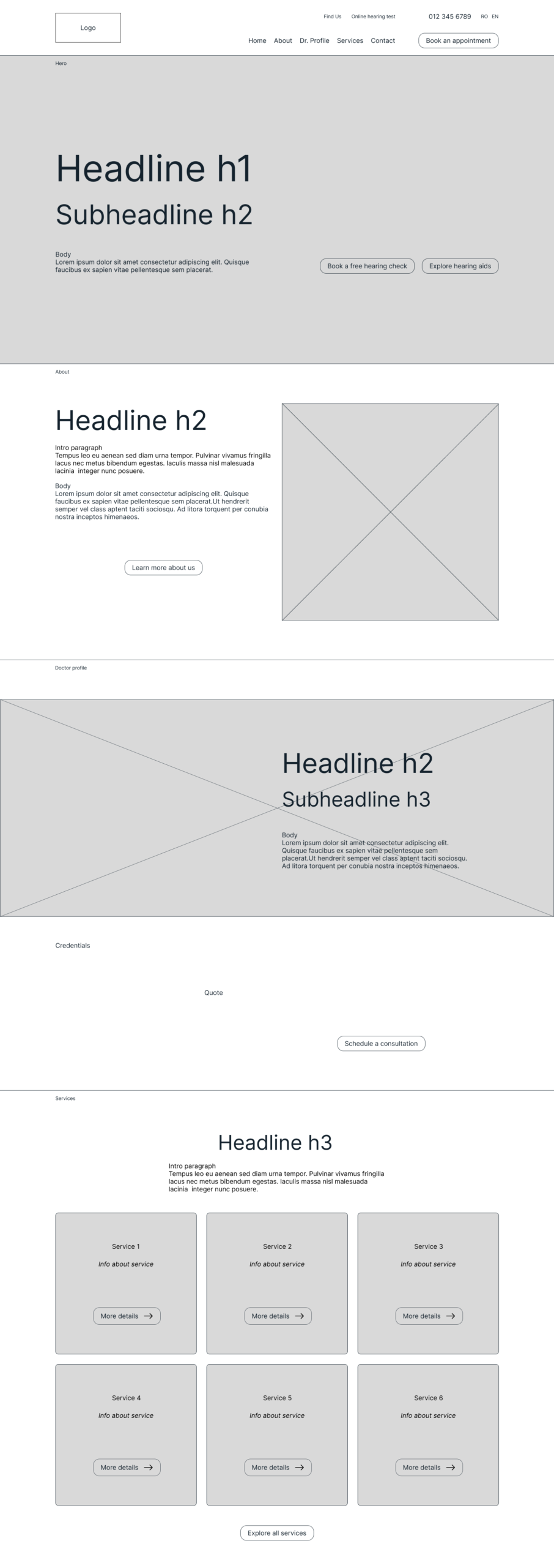
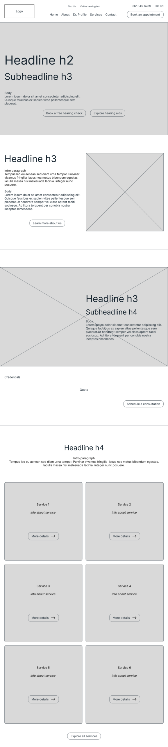
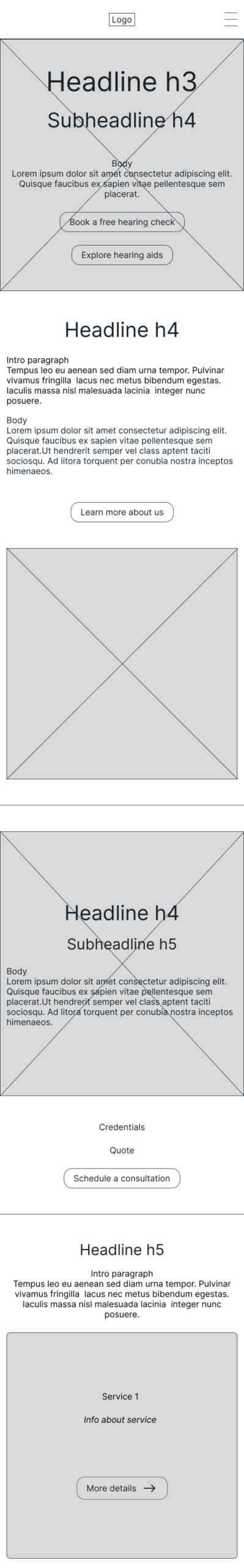
Below is a comparison showing how the information architecture and UX decisions shape the low-fidelity wireframes, and how these foundations evolve into high-fidelity interfaces. Each section demonstrates how structure, flow and clarity translate into a calm, precise, and sensory digital experience.
Built on a precise structural foundation, the responsive design translates flawlessly across desktop, tablet and mobile, maintaining both clinical clarity and the immersive sensory experience for patients on every device.
Let’s tell your story!
Let’s tell your story!
This project is a conceptual case study for a fictional business and is our original intellectual property, fully created in-house. This design is available for licensing or adaptation should you feel inspired by it.